Where to put your wedding QR code
A wedding QR code works or fails on placement, size and light. Five rules that decide it, and the two spots that quietly waste the card.
July 29, 20266 min read
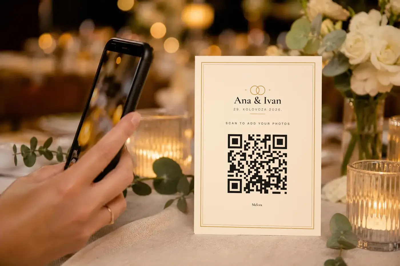
A wedding QR code is not a design problem. It is a logistics problem. The code gets scanned by most of the room or by six people, and the difference is almost entirely where you put it, how big it is, and whether anyone can read it in the light the room is actually lit by.
None of what follows is expensive or difficult. It is the sort of thing that seems obvious once somebody says it and is very easy not to think about at all, because the card is usually the last item on a list of two hundred and gets decided in ten minutes.
One card per table, standing, at seated eye level
The reliable placement is a small standing card in the middle of each table, tall enough to be read by somebody sitting down without picking it up. That is the whole rule and it does more work than the other four combined.
A guest who has to lift, turn and angle a card is a guest who reads the first line, decides it is not urgent, and puts it back down. Flat cards lying on the tablecloth are worse again. Within twenty minutes they are under a plate, a wine glass or a folded napkin, and by the time the tables are cleared nobody has seen them at all.
One per table also means the card is in front of every guest rather than near them. At a round table of ten, a single card at one end is genuinely invisible to the four people opposite. Print one per table and put it with the centrepiece, not beside it. If you do not have a card yet, the free QR card maker makes one for any album link, at the exact size of an A6 table card.
Make it bigger than feels necessary
The working minimum for a code scanned from arm's length is about four centimetres square. Below that, older phones and anybody with a smudged lens will struggle, and struggling for more than a couple of seconds is the same as failing. Five to six centimetres is comfortable and still fits on a card that looks like stationery rather than signage. Whatever size you settle on, leave the blank border around it alone: the QR standard asks for a clear margin four of the code's own squares wide on every side, and trimming that margin to balance a layout is a common way to break a code that looked fine on screen.
Size interacts with distance, which is why the standing card matters twice. A guest leaning across a table is scanning from sixty or seventy centimetres, not twenty, and a code sized for a phone held against it will not resolve from there. If you are unsure, print one and try it yourself, at night, in a dim room, at the distance a seated person would actually hold their phone.
There is no penalty for going larger except the look of the card. There is a real penalty for going smaller, and you will not find out about it until the night.
Your wedding QR code is not a place for the colour scheme
It is tempting to print the code in the wedding colours. Resist it, and resist it hardest for gold, blush and sage, which are all mid-tones. A scanner needs a hard difference between the dark modules and the light background. A warm metallic on cream can fall below what a phone camera can separate, and it will do that exactly when the room is lit by candles, which is exactly when your guests are using it.
Keep the code near-black on near-white and let the card around it carry the palette. The frame, the paper, the type and the names can all be as soft as you like. The square in the middle is a machine-readable object and it has one job.
The same goes for putting a photograph or a monogram behind the code. Every decoder tolerates some of it and none of them tolerate it reliably in low light, and low light is the condition the card lives in.
Say what it does, in one line
A bare code gets scanned out of curiosity by a few guests and ignored by most. One short line above it, something like scan to add your photos, changes the response rate more than any other single element on the card. It is the cheapest thing on this page and the one most often left off, because to the person who designed the card the purpose is obvious.
It is not obvious to a guest. Your grandmother does not know what the square is for unless you tell her, and neither does the friend who assumes it is the menu, the seating plan, the wifi password or a link to a registry. All four of those are things a code on a wedding table has plausibly been in the last few years.
Write the line in the language the room speaks, put it above the code rather than below it, and keep it to five or six words.
Print the link as text as well
Some cameras will not focus, usually the older ones. Some guests have the scanner switched off in settings and will not know where to turn it on. Some will try once, get nothing, and give up rather than ask. A short link and a code they can type by hand is the fallback that catches all three, and it costs one line at the bottom of the card. While you are down there, put the wifi password on it as well, because the venue connection is the other thing that stops people and guests ask for it anyway.
Make the written link short enough to type if a camera cannot scan the code. Melora’s event card studio can show the gallery link, event code, name and date. Check those options in the preview, download the final PDF or PNG, and print it yourself or send it to a print shop. Melora supplies the files rather than including physical printing.
The two placements that waste the card
Both of these feel efficient and both underperform a card on the table by a wide margin.
- In the invitation. It arrives months early, the gallery is empty, the guest scans once out of curiosity, sees nothing, and never returns. By the day itself they have forgotten it exists, and the invitation is at home in a drawer.
- On a single sign by the entrance. Everyone walks past it once, in a queue, carrying a coat and a gift and somebody else's child. Nobody stops to get their phone out in a doorway with people behind them.
A sign by the door is not useless as a second placement. It is useless as the only one. If you are printing a welcome sign anyway, put the code on it, and then still print the table cards.
If you only do one thing, do the tables. And ask on the night rather than afterwards, which is the other half of getting the photos at all.